3D Design and Illustration
The second project within the multi-dimensional illustration module was 3D design which involved creating a 3D album cover inside a 12x12" box.
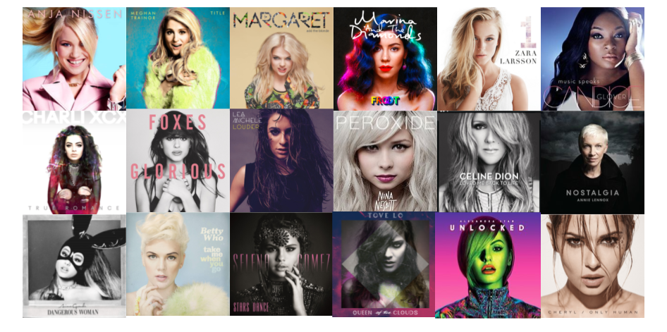
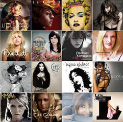
The album title, artist name and music genre were randomly generated for us. The title of my album was 'My Sausage Party' by 'Alan Trotter is Mechanical', who is a female solo artist. I was hoping for another genre such as grunge, punk or britpop as I think I would have found it quite easy to be creative with these genres. Although I listen to a lot of female solo artists I've never been particularly excited by their album covers. As you can see from the images below, after doing some research it confirmed that female solo artist's album covers are, in my opinion, some of the most boring, usually just sporting a picture of their face. I definitely found it hard to get going with this project as I struggled to be creative whilst trying to make sure my album portrayed the genre I had been given.
|
|

After some brainstorming I decided I wanted to make the main character/image on my album cover a pig, to link the 'sausage' from the title and 'trotter' from the artist name. I wanted to go for a silver colour scheme to keep with the 'mechanical' theme but wasn't very inspired by my thumbnail sketch ideas of using cogs and other metal objects. I looked at some more glitzy and glamorous album covers and artists such as Dua Lipa and Olivia Rodrigo, and disco icons like Cher and Donna Summer. I love the sequins and glitter and 'camp' themes of these artists.
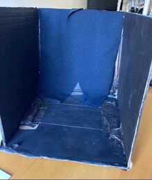
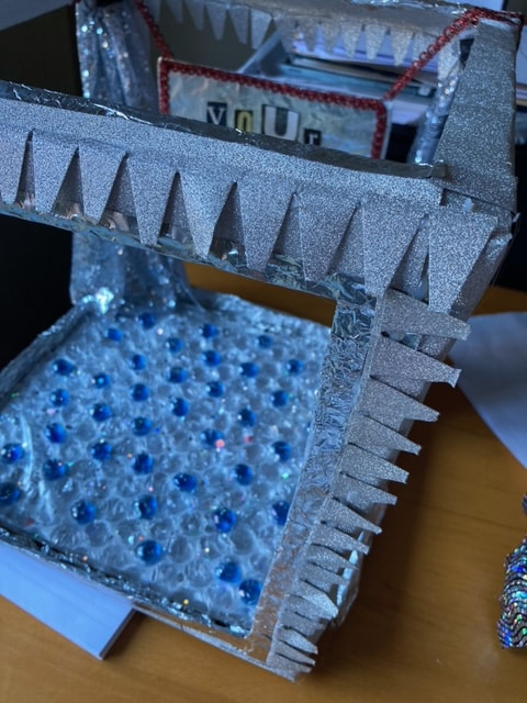
The first box I made had four solid sides but I found this too dark for the look I was going for so I made a second box with open sides and roof to allow more light in. I had also painted the original box completely black which I had hoped would make it look classy and glamorous but didn't have the desired effect so I went for a lighter colour scheme for the final album cover. The prototype box was painted but I felt it didn't look as clean and neat as I wanted so I wrapped the final box in silver glitter material for a more polished look.

Almost all of the objects and materials used to make my album cover were found items from around my house. I made the disco floor by slotting glass beads into bubble wrap and adding some glitter over the top. The sides of the box have been wrapped in left over Christmas cracker packaging.
|
|

The star of the album cover is my childhood piggy bank. She was already quite groovy with her silver metallic horns and tail but I jazzed her up a bit more with some face gems and a disco tutu skirt. The skirt is made out of a scrap of fabric I bought from an independent festival fashion brand, the holographic pattern was perfect for the glitzy disco theme of the box. I later added more gems for the final album cover to make her even more sparkly and bold.
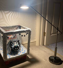
I experimented with lighting to try and get the best atmosphere for my album cover. I originally took photos in daylight with just normal lighting which looked OK but wasn't quite achieving the effect I wanted. I knew it was important to make the pig stand out as the artists on the solo female album covers I found when doing research were the main focus of their albums and I needed to make sure to keep with this theme. I found a really bright spotlight style lamp at home and thought this was perfect to light up the pig and create a cool disco vibe for the album cover.

This is the final album cover. After I photographed the 3D album I added the artist name on Photoshop. I had originally tried putting the artist name on the actual 3D album cover but after experimenting with Photoshop I decided it looked neater and more professional when done digitally. I did, however, choose to keep the hand made album title sign as I liked the effect of the collage of letters. I like how the theme of my album cover has turned out, I think it's fun and eye-catching, and in keeping with the disco theme. If I were to do it again I would make the disco ball sit slightly higher as I realised later that it slightly covers the first word of the album title. I did try adding the album title digitally as well as you can see below but didn't like this as much as the hand made version. Another thing I would possibly do differently if I were to create this album cover again would be to make the actual box itself out of metal, to add to the mechanical theme and maybe make it stand out more. I do like how the box is open around the sides and the top as this has made it brighter and more airy. I also like how the colour scheme is in keeping with both the mechanical artist name and the disco genre.
