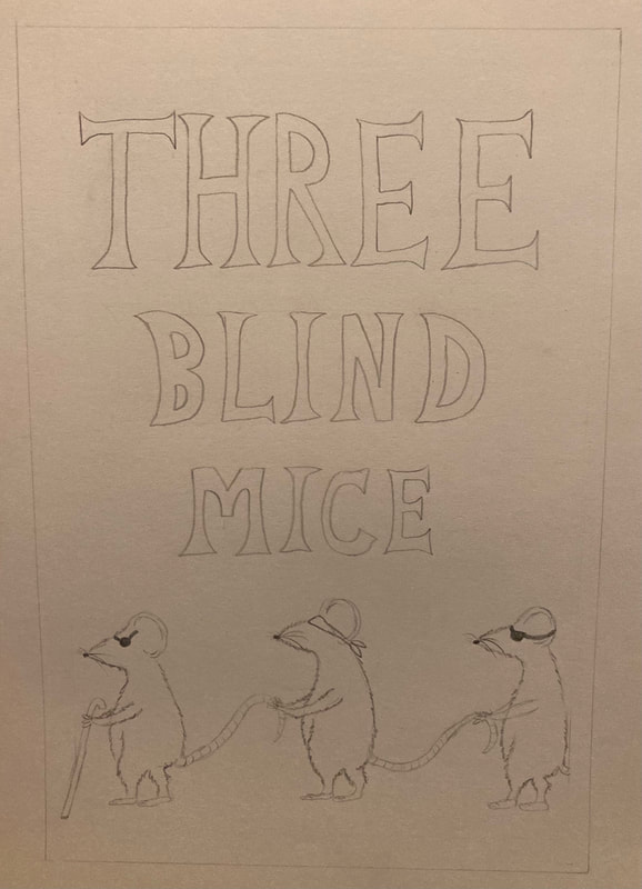
Our first project in the first semester was a group project to produce a comic based on a nursery rhyme. This is the cover I drew which was then digitally enhanced. From this project I learnt that it's best for someone to take more of a leadership role to ensure projects are finished on time, rather than all trying to be nice and not tell each other what to do.
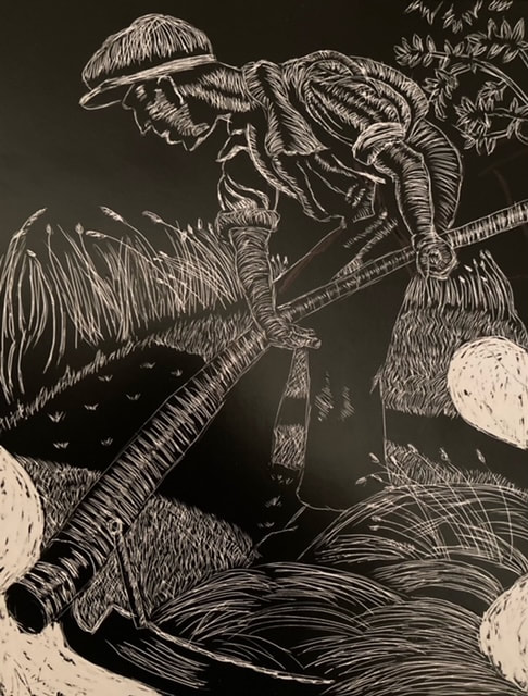
This piece was created by etching onto scraperboard. I struggled at first as I've never used this technique before so it took a few attempts to get used to it. I like the effect of it and I'll definitely be using it again.
|

This image was produced using an ink pen. I like how it turned out and the moody effect it has but it definitely took the most getting used to and I dropped ink on the picture a few times so it's not as neat as I'd have liked.

I normally avoid drawing faces like the plague so wasn't looking forward to this challenge, but I quite like how it turned out. I made sure to draw how the picture looked rather than just how I thought a face should looked.
|
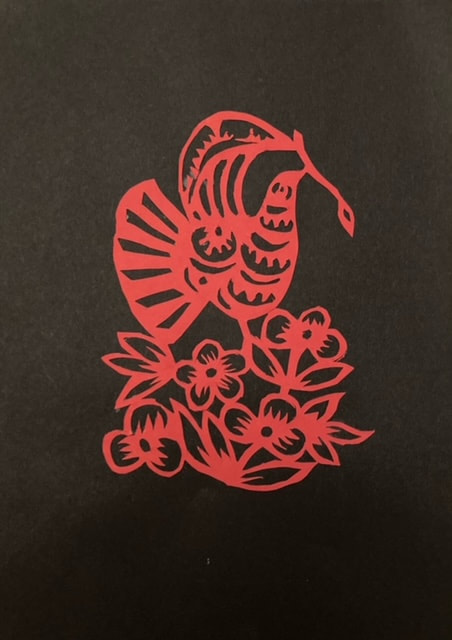
This is a paper cutting from our second project 'Technical Skills', which involved a lot of cutting and sticking of paper, really going back to basics.
|
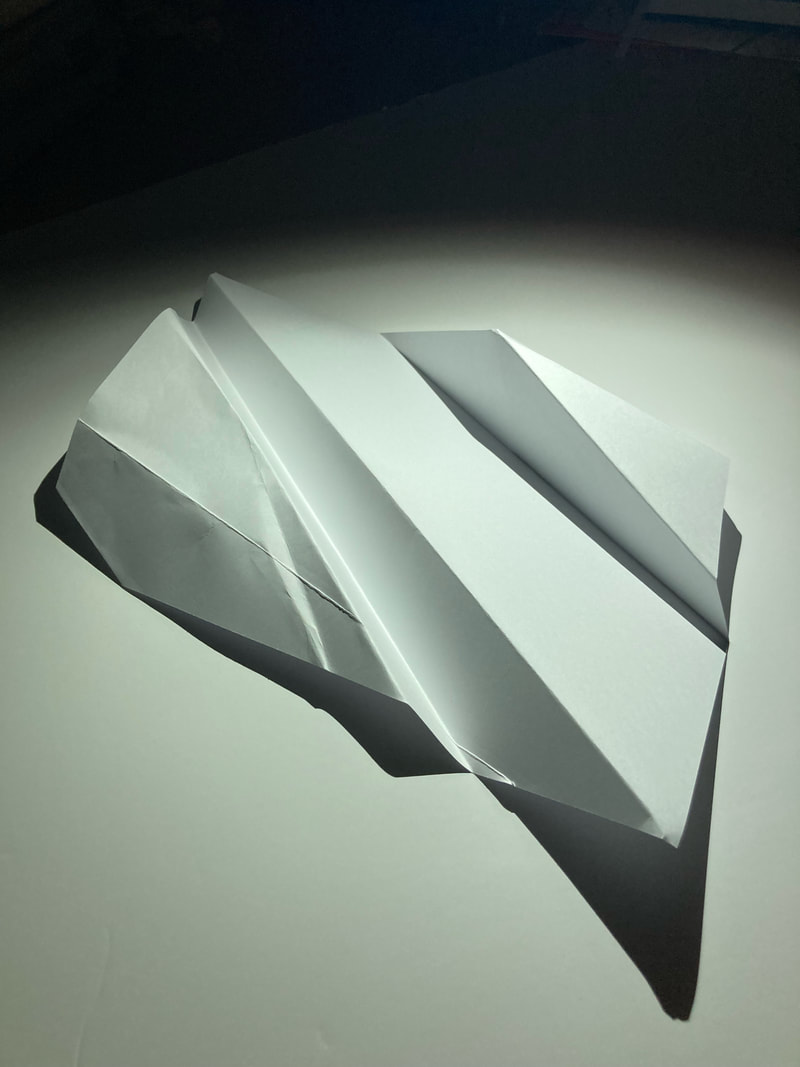
A piece of folded paper art I experimented with looking at lighting and shadows.
|
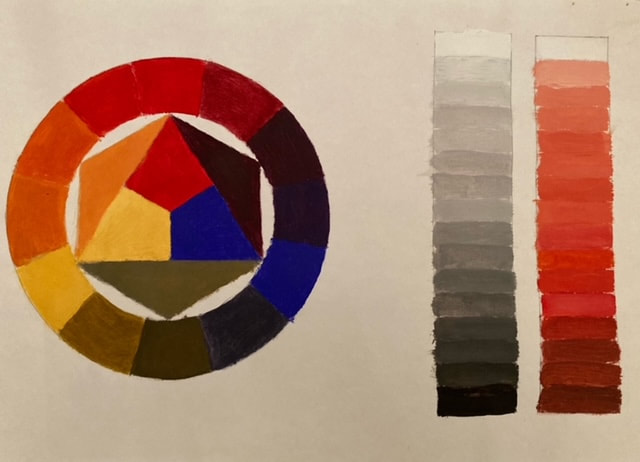
For our fourth project we looked at colour composition.
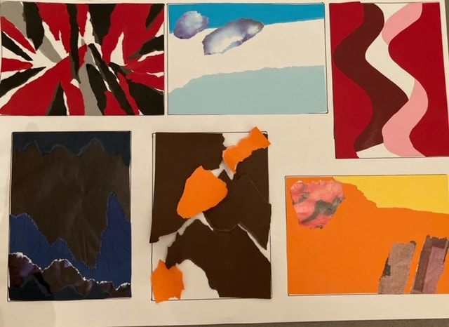
A series of six collages made from paper to communicate different themes. After I stopped overthinking it I enjoyed creating these images and it was fun to let loose and create abstract images.
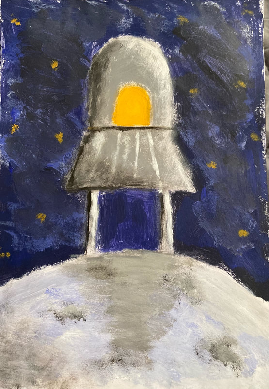
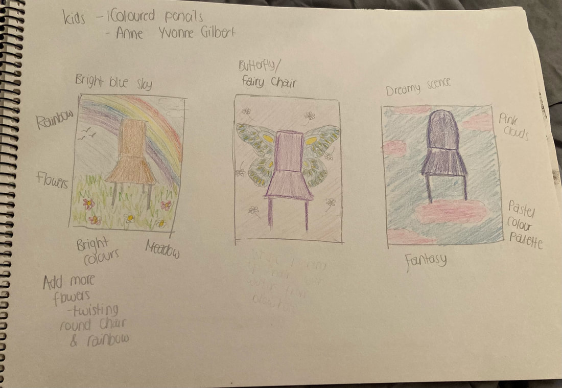
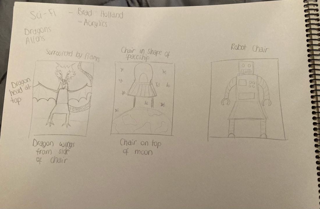
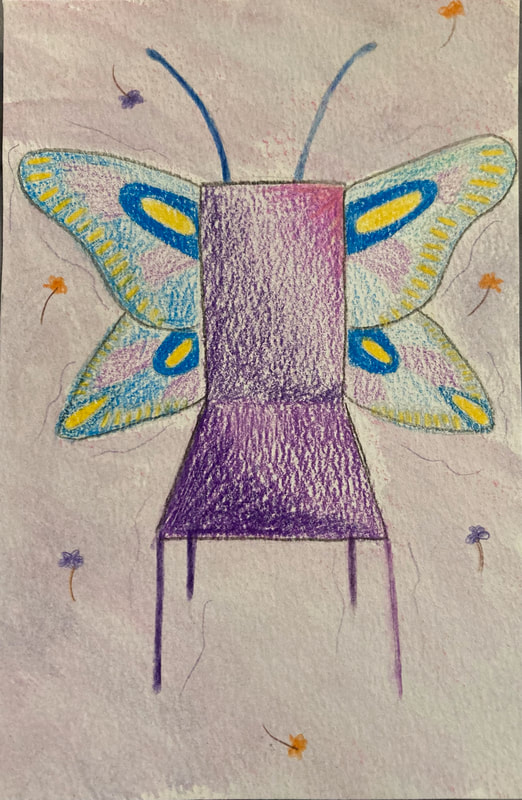
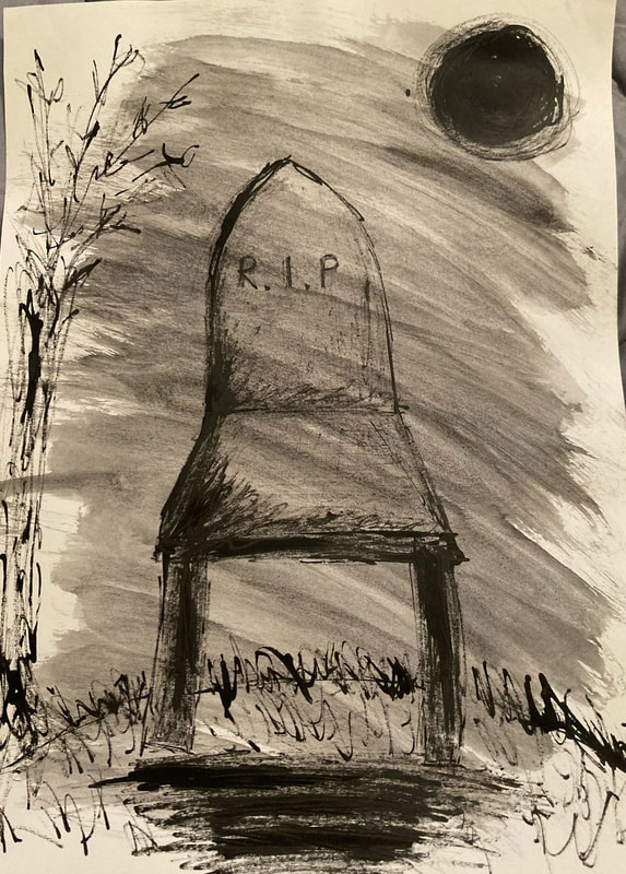
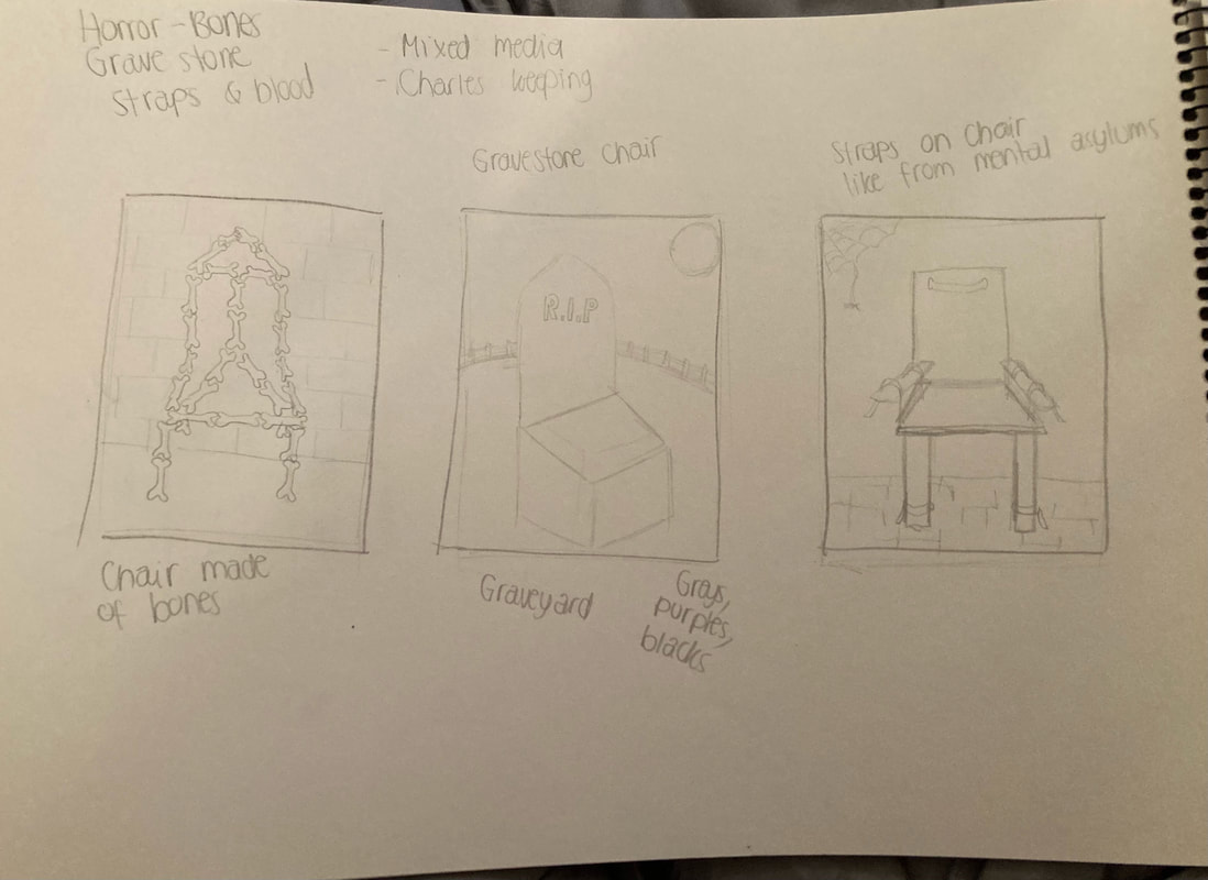
These three images of chairs were part of a project looking at composition and working in the style of other artists. These are three book covers. The first produced in the style of Anne Yvonne Gilbert for a children's book using coloured pencils. The second is done in the style of Brad Holland for a sci-fi book using acrylic paint, and the third in the style of Charles Keeping for a psychological horror book using inks and watercolour.
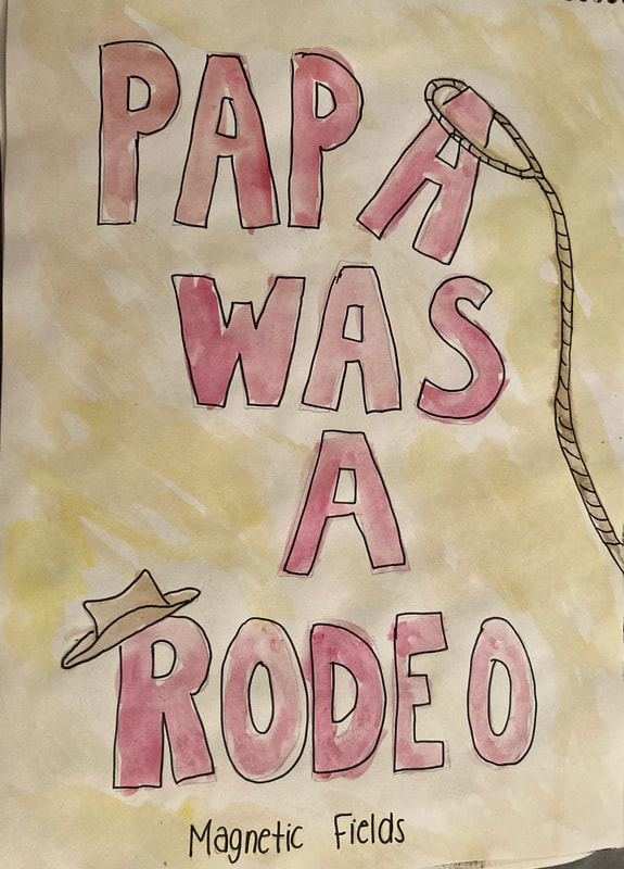
As part of the linear narrative project I created an issuu book based on the song 'Papa was a Rodeo' by Magnetic Fields. I drew the 8 page spread by hand and used watercolours and fine liner pen to illustrate it, and then uploaded it to issuu to turn it into a book. The link for the book can be found here: https://issuu.com/grillustdropbox/docs/song_book
|
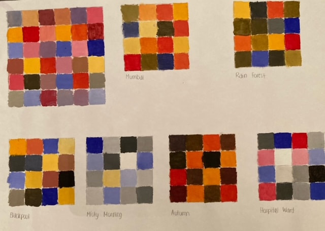
These were a series a colour blocks based on the Bauhaus colour and personality exercise. The bigger square is filled with colours that I find visually appealing, which contains mostly light, bright colours, with lots of pinks and purples. The other squares are colour palettes for different themes, like 'Hospital ward' and 'Autumn'.
These are some of my initial thumbnail sketches for each book cover concept, which I then chose the best idea from to produce a more detailed piece.
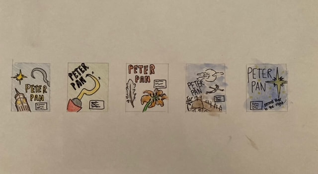
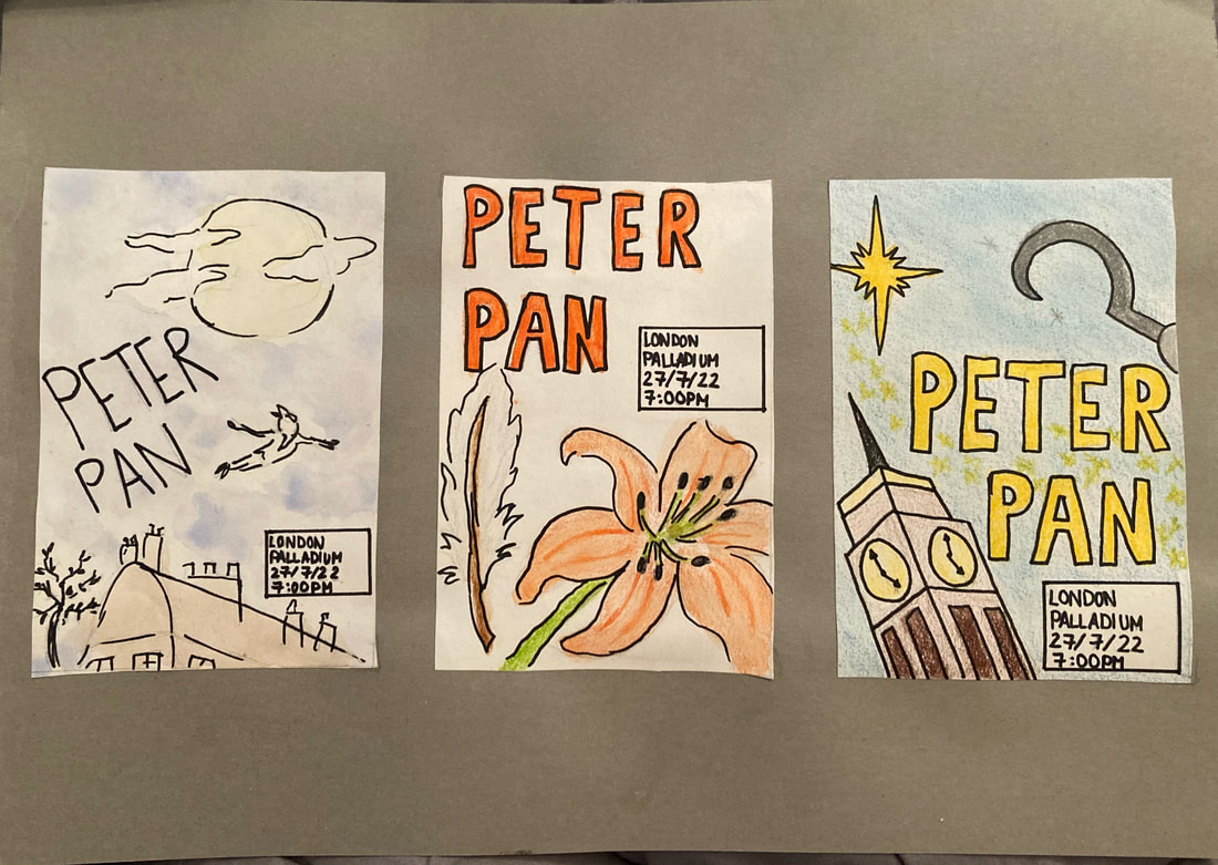
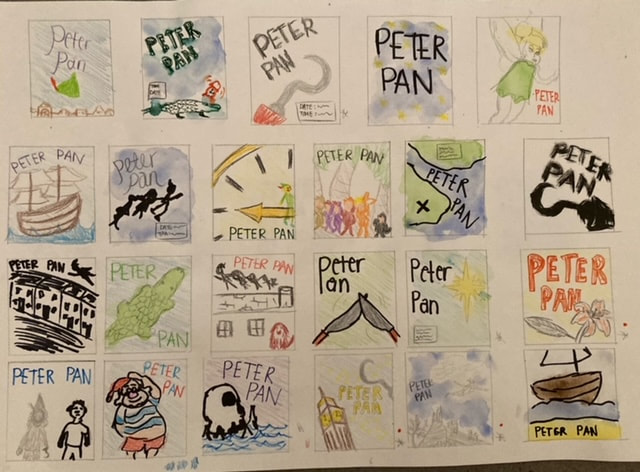
As part of the 'Drawing and Visualising' project I produced a series of thumbnails for a theatre production poster. I found the prospect of producing so many ideas in such a small amount of time quite daunting as I normally spend too long just trying to think of ideas and trying to make them look perfect straight away, but I found this exercise very helpful to allow me to get a lot of ideas down on paper. It also helped my editing skills as I had to choose what I thought were the best thumbnails to produce in more detail. I also tried to use a range of mediums rather than just sticking to one that I was comfortable with, to experiment with what works best for different briefs.
|
|
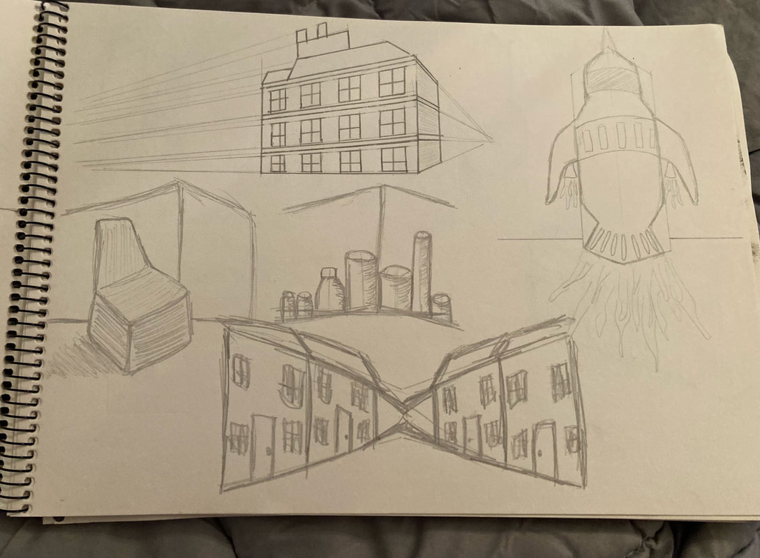
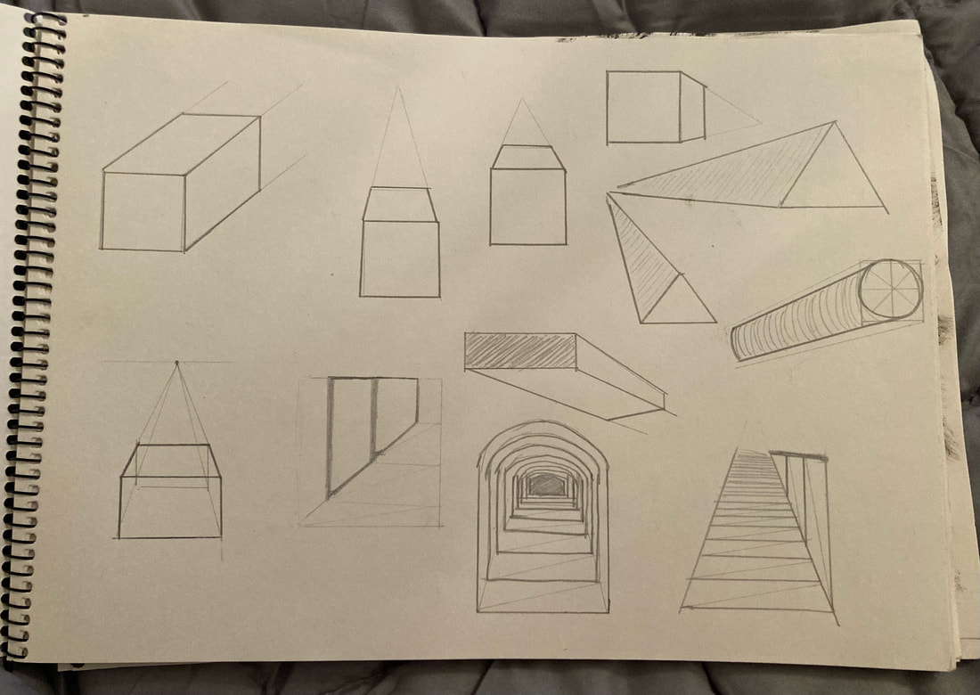
For the third project we focused on perspective. I struggled a bit at first to not just draw what I thought things should look like but I feel a lot more comfortable with it after some practice. I'd still like to practice more with things like people as I'm still not 100% confident with this.
|
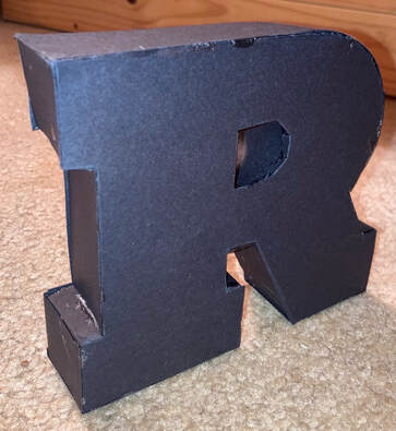
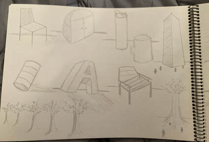
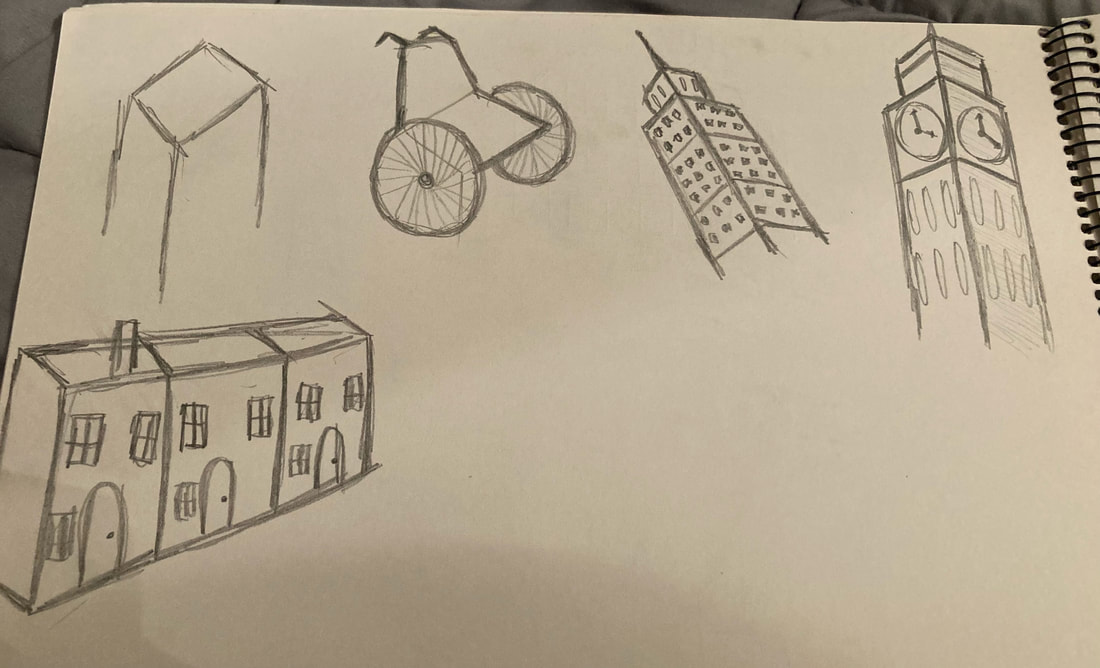
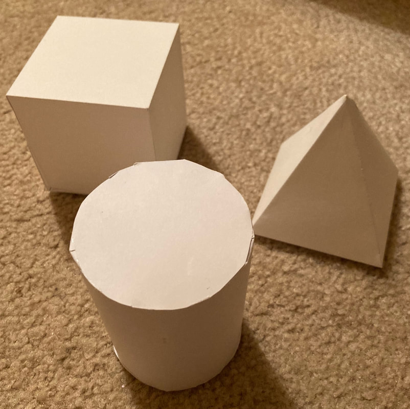
For the old school technical project we had to make some 3D shapes. The 3D 'R' was by far the hardest model to construct and isn't as tidy as I'd have liked. The 3D shapes were much easier to make and they came out quite well.
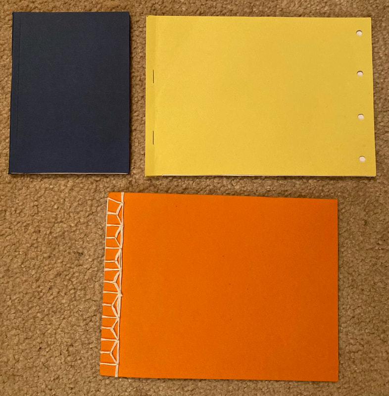
The first task in the 'Old School' project was to make three different types of sketchbooks. I watched YouTube tutorials to learn how to make them. I found the stab-stitched book the trickiest to create.
|
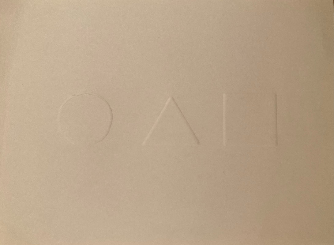
This was my first experience with embossing. It actually turned out to be easier than I'd imagined. If I did it again I'd like them to stand out a bit more.
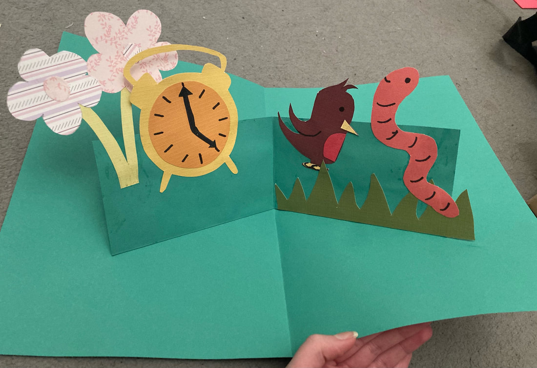
I created a pop up book based on the saying 'the early bird catches the worm'. I'm pleased I managed to make it work properly but would like it to be much more detailed with different layers of paper if I did it again.
|